15 Replies
3131 Views
0 Likes
10 Participants
Last post by Cain Highwind 16 Mar 2009 15:58

Hey guys, not totally sure this is for real, but I found a guy on Dev Art who uploaded a concept piece he drew for the Gatch CGI film. Thought you might like to take a look. Needless to say, I'll be fishing for more info!
Concept Art

Transmute Jun
Queen of the Bird Missiles
posted 13 Mar 2009 18:21
Interesting... how recently was this done?
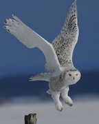
Not sure...but this next pic is a rejected piece from early production...this guy *just* posted this stuff...so I'm guessing it's a little more current...
Rejected Piece
clouddancer
Gatchamaniac
posted 13 Mar 2009 19:02
Interesting work.
Nice to hear this is still going forward.

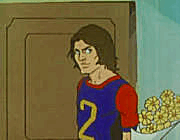
Neat concepts. Nothing too far-fetched and just enough "futuristic" imagery for the cityscape that it's not overwhelming and you think it's being done in an entirely different universe. One interesting thing though... I noticed the brand placements in the second concept. I'm sure they're just placeholders, but it made me laugh that they used the Apple logo and Apple.com on the windows, and that the K-Mart K and Rite-Aid insignias were both in there too. Apple I can understand (assuming that the concept art is being done on Mac's), but K-Mart and Rite Aid??? Ok, maybe if the Goons need new underwear and salve for their wounds..... 

trideegurl2
Honoured Member
posted 14 Mar 2009 10:36
bua ha hey no one can resist the blue light!!!

Galactor is probably registered at Rite-Aid so they can buy bandages and aspirins by the ton after the goons deal with the Science Ninja Team!  Seriously, I'm glad to hear that they are still going forward with Gatchaman. I hope they have enough funding to continue with it.

Cain Highwind
Exalted Member
posted 14 Mar 2009 21:24
I'm still kinda iffy on the way Ken looks in the second piece. But it's just concept art, and I certainly can't draw that good, so no complaints.
Weird thing is, I found this piece on Japanese art site Pix-iv. Not movie related but I thought, "DAMN! This looks like concept art for the movie"
http://img16.imageshack.us/my.php?image=743981m.jpg
What a great find, Cain! It certainly does look like concept art for the movie, but I am laughing at the extra "boobage" they gave to Jun...she's gotta have a backache! 
Good find Cain...
I wish I knew where to do searches, and come up with great finds, like you guys do.
Transmute Jun
Queen of the Bird Missiles
posted 15 Mar 2009 07:33
Oh my, Cain... that's certainly very... um... phallic... added to Jun's extra large endowments...
Still, an awesome picture!

its to balance the bike.
Either that or shes got extra semtex hidden down her birdstyle.

Ebonyswanne
Gatchamaniac
posted 15 Mar 2009 16:28
Originally posted by Cain Highwind I'm still kinda iffy on the way Ken looks in the second piece. But it's just concept art, and I certainly can't draw that good, so no complaints. Weird thing is, I found this piece on Japanese art site Pix-iv. Not movie related but I thought, "DAMN! This looks like concept art for the movie" http://img16.imageshack.us/my.php?image=743981m.jpgI can see why you're not complaining. Jun's not holding back her assets in that piccie.
Ebonyswanne
Gatchamaniac
posted 15 Mar 2009 16:30
Springie, some of the artwork you posted from Deviant is still good and not over the top.
The fight scene the Eagle blended in to much. They needed stronger colours for either him or the goons...and those abs...my my...  Very good artwork... I can't draw like that thats for sure.
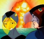
Thanks Springie and Cain for posting those.
Must say that Cain's pic gives the Swan extra abilities in fighting the goons.  The Eagle/Condor, couldn't tell which, was rather well shaped in springies third pic too. My oh my!
Cain Highwind
Exalted Member
posted 16 Mar 2009 15:58
Originally posted by EbonyswanneOh no no no. I was talking about that Ken image. I like mammaries as much as the next guy, but not that big, that's just gross. I like the image because of the color and the sleek design of her bike, that's all ^^;;Originally posted by Cain Highwind I'm still kinda iffy on the way Ken looks in the second piece. But it's just concept art, and I certainly can't draw that good, so no complaints. Weird thing is, I found this piece on Japanese art site Pix-iv. Not movie related but I thought, "DAMN! This looks like concept art for the movie" http://img16.imageshack.us/my.php?image=743981m.jpgI can see why you're not complaining. Jun's not holding back her assets in that piccie.
Please login to post replies.