19 Replies
21792 Views
0 Likes
12 Participants
Last post by Transmute Jun 30 Dec 2010 09:00
Springie
Her Royal Fluffiness...Swan of Swans...
posted 19 Feb 2009 10:03
(edited 19 Feb 2009 10:14)
Hey guys... Glass House Graphics is now selling Wilson Tortosa's art from the BOTP comics. Prices range from $20 to $70 a page. Thought you might like to know...it is interesting to look at the original sketches!
http://www.artandcomicsstore.com/servlet/the-Wilson-Tortosa-original-art/Categories
shamrokchick
Forum Legend
posted 19 Feb 2009 12:22
Interesting... thanks for the link!
clouddancer
Gatchamaniac
posted 19 Feb 2009 13:39
Thank you for the link Springie. There are some nice images there.
i like how they show the "rough" with the finished product.

Transmute Jun
Queen of the Bird Missiles
posted 20 Feb 2009 08:25
Neat link, Springie! Thanks for posting!
Well I resisted for a while but my names not
Veritas 'no will power' Lamb, for nothing.
Funnily enough the ones I picked are Joe / Jason ones.
Transmute Jun
Queen of the Bird Missiles
posted 25 Feb 2009 06:19
I'm wondering how many of these Tatsunokofan has picked up.... 
tatsunokofan
Gatch Guru
posted 25 Feb 2009 09:29
Hi all!
I'm wondering how many of these Tatsunokofan has picked up....None of them, actually. I have little to no interest in Tortosa's artwork, just as I have little to no interest in the Top Cow BotP comic. I own a couple of pages from the run, but I got those just to have some example of the comic art and because they were cheap (Like $10.00 for two pages). I know some people loved Tortosa's art, but I wasn't grabbed by it. The first issue of the comic was very much on-model for the characters, but as the comic run progressed, Tortosa's artwork became less and less faithful and more and more like the standard "anime-esque" style that people outside of Japan seem to think is what all anime looks like. Tatsunoko's classic anime had a style that was unique and did not follow the standard design pattern, and Tortosa failed to deliver on that count. If the writing of the comic hadn't been so bad, I suspect that fans would have complained about it more, but even with the off-model style, the artwork was stellar compared to the writing. Let me make one thing clear, I'm not trying to say that Tortosa is a bad artist. He has a lot of talent, and has shown more than once that he has the ability to do fantastic work. Unfortunately, beyond the first issue of the comic, he didn't stretch himself to do an anime-syle comic that was drawn in something other than the standard anime-style look. Had he done as well with issue #'s 2 and up, I'd be a big fan of his work on this comic. But as things stand, I'd rather get more of Winslow Mortimer's artwork from the Gold Key BotP comic. James
The first issue of the comic was very much on-model for the characters, but as the comic run progressed, Tortosa's artwork became less and less faithfulI agree, however Ive just decorated the upstairs landing and I think the 3 I got will look good in frames at the top of the stairs with the Rogue Squadron art work. I'm like, totally an interior designer, but cheaper.


Ebonyswanne
Gatchamaniac
posted 25 Feb 2009 14:19
I never warmed to his version of Princess. But he a fantastic artist, I think Tats is right in that he slipped as he progressed with the comics in staying true to the style unique to anime.
I'm not much of a fan of the current way anime is drawn. Something about it...I dunno how to put it....its all pointy noses and they all look the same.
shamrokchick
Forum Legend
posted 25 Feb 2009 15:21
I agree... I'm not a fan of modern anime, seems like every girl has the same face. But I do appreciate Tortosa's artwork.
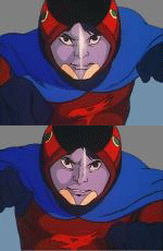
Your avatar is adorable, Shamrokchick! The little birdie, especially, is sooo cute!
 It's very cute!!! And fits in with the current weather!
shamrokchick
Forum Legend
posted 27 Feb 2009 08:26
Thanks! A friend sent me the pic to cheer me up after having the flu/cold all week  . The cuteness did make me smile

. The cuteness did make me smile
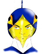
I'll have to check these out sometime. Right now my "Gatchaman money" is tied to grabbing the collections on DVD.

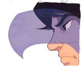
Becky Rock
Gatchamaniac
posted 7 Feb 2010 11:13
Originally posted by tatsunokofan Hi all!I agree with you, James. I don't like most anime art because of the large eyes and disproportional bodies.I'm wondering how many of these Tatsunokofan has picked up....None of them, actually. I have little to no interest in Tortosa's artwork, just as I have little to no interest in the Top Cow BotP comic. I own a couple of pages from the run, but I got those just to have some example of the comic art and because they were cheap (Like $10.00 for two pages). I know some people loved Tortosa's art, but I wasn't grabbed by it. The first issue of the comic was very much on-model for the characters, but as the comic run progressed, Tortosa's artwork became less and less faithful and more and more like the standard "anime-esque" style that people outside of Japan seem to think is what all anime looks like. Tatsunoko's classic anime had a style that was unique and did not follow the standard design pattern, and Tortosa failed to deliver on that count. If the writing of the comic hadn't been so bad, I suspect that fans would have complained about it more, but even with the off-model style, the artwork was stellar compared to the writing. Let me make one thing clear, I'm not trying to say that Tortosa is a bad artist. He has a lot of talent, and has shown more than once that he has the ability to do fantastic work. Unfortunately, beyond the first issue of the comic, he didn't stretch himself to do an anime-syle comic that was drawn in something other than the standard anime-style look. Had he done as well with issue #'s 2 and up, I'd be a big fan of his work on this comic. But as things stand, I'd rather get more of Winslow Mortimer's artwork from the Gold Key BotP comic. James
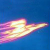
Found another link of the comic art (and some sketches by various comic artists) over here
Thought some of the sketches deserve visibility.
clouddancer
Gatchamaniac
posted 29 Dec 2010 16:03
Thank you for that link Boeke!
It is always nice to see other peoples depictions of the team. There are some really nice pieces there.
Really neat stuff! Thanks for sharing those with us, Boeke! 

gatchamarie
Gatchamaniac
posted 29 Dec 2010 23:14
That's really a cool find, Boeke! Thanks a lot for sharing! It's always nice to see more drawings of other, different artists!
Transmute Jun
Queen of the Bird Missiles
posted 30 Dec 2010 09:00
Great link! Thanks for sharing, Boeke!
Please login to post replies.